How Visual Perception Shapes Marketing
Marketing is often treated as a game of messaging, pricing, and positioning. But before a consumer reads a slogan, compares features, or decides whether a brand feels trustworthy, they see.
Visual perception sits at the foundation of marketplace behavior. Consumers encounter products, packaging, stores, websites, ads, and interfaces first as visual experiences. The way those experiences are constructed can shape attention, emotion, judgment, and action. A product may seem premium because of its gloss, healthier because of its color, larger because of its proportions, or more effective because of where it is placed in an image.
A major contribution of research on this topic is the idea that visual perception in marketing can be understood through a set of basic components. Rather than only looking at visuals as complete, holistic designs, this approach breaks them down into smaller elements that marketers can actually manipulate. The framework identifies five main components of visual perception in marketing contexts: illuminance, shape, surface color, materiality, and location.
Together, these components help explain why visual design works the way it does.
Seeing by parts, not just as a whole
Consumers do not process visual information only in a broad, holistic way. They also respond to individual visual properties. That matters because a small change in one attribute can shift how a product or brand is interpreted.
A package does not need to be completely redesigned to create a different impression. Changing the brightness of a retail display, altering the color saturation of an image, switching from matte to glossy material, or repositioning a product in an ad may be enough to influence behavior.
This piecemeal view of perception is especially useful in marketing because it turns vision into something actionable. It gives marketers a practical way to think about design choices and gives researchers a structured way to study them.
A marketing review by (Sample et al., 2020) lists up the components of visual perception and their aspects.
The five components of visual perception
1. Illuminance: the role of light
Illuminance refers to the amount and quality of light perceived on an object. Without light, visual perception cannot occur at all. But in marketing, lighting is not just a technical necessity but also a strategic cue.
The research highlights four aspects of illuminance: brightness, contrast in lighting, directionality, and light color.
Brightness has received the most attention in marketing studies. Brighter lighting tends to increase arousal and engagement. Consumers are more likely to pick up and examine products under bright light. At the same time, dimmer lighting can produce different downstream effects. In food settings, lower light has been linked to more indulgent choices, possibly because consumers feel less alert and less socially exposed.
Other aspects of illuminance remain underexplored. The direction light comes from, for example, may affect how consumers interpret shadows, form, and mood. The color temperature and hue of light are also increasingly relevant as digital and LED lighting give retailers and consumers greater control over the visual environment. These lighting decisions may influence not only aesthetic perception, but also comfort and even behavior.
2. Shape: how form communicates
Shape refers to the space an object appears to occupy, defined by its outer boundaries. Shape helps separate an object from its surroundings and gives it meaning before any words are processed.
The framework breaks shape into four facets: dimensionality, unity, demarcation, and shape contrast.
Dimensionality includes height, width, and length. A consistent finding in marketing is that consumers often misjudge volume based on dimension. Taller packages, for example, are frequently perceived as containing more than shorter, wider ones, even when volume is equal. That bias can influence expectations, value perception, and even consumption.
Unity refers to how cohesive an object appears. An object that looks fragmented or visually incomplete may be seen as smaller or less stable than one that appears whole. Demarcation, or the nature of the outer boundary, also matters. Boundaries can appear smooth, balanced, dynamic, or irregular, and consumers respond differently depending on how well those boundary cues fit the brand.
Shape contrast captures how much a shape deviates from its context or from category expectations. Unusual shapes can attract attention because they stand out. But there is a tradeoff. Shapes that are too far from the norm may be harder to process and less liked, even if they are more noticeable.
Shape can therefore affect perceived size, personality, usability, and distinctiveness.
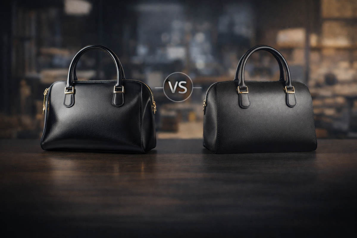
3. Surface color: one of marketing’s most powerful tools
Surface color is among the most flexible and visible elements marketers can control. The framework separates it into three facets: hue, saturation, and lightness.
Hue refers to the color family itself, such as red, blue, yellow, or green. Research shows that hues often carry metaphorical meaning. Red may be associated with aggression, urgency, or savings. Blue can signal calmness and relaxation. Gold can suggest luxury or status. These associations can shape expectations and behavior even when consumers are not consciously analyzing them.
Saturation refers to the intensity or purity of a color. More saturated colors tend to feel more vivid and attention-grabbing. In many contexts, consumers prefer color-rich images over black-and-white ones. Saturation can also affect judgments such as perceived size and healthfulness.
Lightness refers to how close a color is to white or black. Lighter colors are often preferred and can create impressions of health, softness, or lightness in both literal and symbolic ways. Research has shown that lightness can influence food judgments and consumption patterns, making some items seem healthier or more indulgent.
Because surface color is so easy to manipulate in both digital and physical formats, it offers marketers enormous leverage. At the same time, it is more complex than simple “red means this, blue means that” rules. Interactions between hue, saturation, and lightness remain an important area for future work.
4. Materiality: what surfaces suggest visually
Materiality refers to the visual qualities of a surface, including its texture and the way it reacts to light. This component includes visual texture, reflectance, opacity, and fluorescence.
Visual texture is what a surface appears to feel like, regardless of how it would actually feel to the touch. A visually rough, smooth, crumpled, or polished surface can influence quality judgments, cleanliness perceptions, and desirability.
Reflectance concerns how much a surface mirrors its surroundings. Glossy surfaces, for instance, often attract more attention than matte ones.
Opacity refers to how transparent or opaque a surface is. In packaging, transparency can make a difference in what consumers choose and consume because seeing the product changes expectations and trust.
Fluorescence involves surfaces that emit or appear to emit light. Although this has been largely ignored in marketing research, it is becoming increasingly relevant in a world of glowing screens, illuminated devices, and products designed to radiate light.
Materiality is especially important in digital commerce, where consumers increasingly judge products from images alone. When shoppers cannot touch an item, visual surface cues do more of the persuasive work.
5. Location: where things appear changes what they mean
Location refers to where an object appears in relation to other objects and within a broader visual field. It includes positioning, orientation, spacing, and movement.
Positioning affects interpretation in subtle but meaningful ways. Consumers may infer power, heaviness, importance, or healthfulness from where an object appears on a package, shelf, or screen. A logo placed higher may better suit a powerful brand. A healthier item may benefit from a different left-right relationship than an indulgent one.
Orientation refers to the angle from which an object is shown. A product facing inward toward the center of a display can generate more favorable responses than one facing outward. Vertical or angled depictions may also signal luxury, prestige, or dynamism.
Spacing changes how relationships are understood. More space between similar products can imply higher quality. But too much space between a product and its promised outcome may weaken perceived effectiveness.
Movement, finally, is one of the most naturally attention-grabbing visual cues. Moving images often outperform static ones in attracting interest, especially in digital environments. As animation, short-form video, and interactive interfaces become more central to marketing, movement becomes harder to ignore as a strategic variable.
What the research shows overall
One of the most striking takeaways from the review is how uneven the literature is. Surface color and shape have received substantial attention. Illuminance and materiality, despite being essential to visual experience, remain much less explored. Movement has also been relatively difficult to study, even though it is becoming increasingly important in real-world marketing.
That imbalance matters as it suggests that marketers may be relying heavily on familiar tools like color and form while underusing other powerful visual levers such as lighting, reflectance, transparency, and dynamic presentation.
The review also points to an important idea: these components rarely work alone. Lighting interacts with color. Shape interacts with texture. Positioning interacts with meaning. A glossy surface under warm light may create a different impression than the same surface under cool light. A product’s unusual shape may be more acceptable when paired with familiar colors. These cross-component interactions represent one of the biggest opportunities for future research.
Why this matters for marketers
The practical implication is simple: visual strategy should be more deliberate.
Marketers today have more control than ever over how products and brands are seen. Digital platforms, advanced packaging, LED lighting, customizable interfaces, augmented reality, and screen-based retail all make it possible to manipulate visual cues with precision. That creates opportunity, but only if firms understand what those cues are doing.
This framework helps marketers move beyond vague ideas like “make it pop” or “make it feel premium.” It encourages more specific questions:
Does the lighting support the product’s intended positioning?Does the shape communicate familiarity or differentiation?Does the color cue health, luxury, urgency, or calm?Does the material finish suggest quality, freshness, or modernity?Does the object’s placement guide the right inference?
When these questions are answered well, visual design becomes more of a strategy than decoration.
The future of visual perception research
As marketing continues to shift toward screens, immersive environments, and consumer-controlled visual contexts, the importance of piecemeal perception will only grow. Researchers have a wide-open field ahead of them, especially in areas like lighting direction, light color, transparency, fluorescence, motion, and three-dimensional digital space.
For practitioners, the lesson is equally clear. Consumers do not merely see brands; they respond to the smallest visual details of how brands are presented. Those details shape what feels credible, attractive, healthy, luxurious, useful, or worth buying.
Reference:
Sample, K. L., Hagtvedt, H., & Brasel, S. A. (2020). Components of visual perception in marketing contexts: A conceptual framework and review. Journal of the Academy of Marketing Science, 48(3), 405-421.